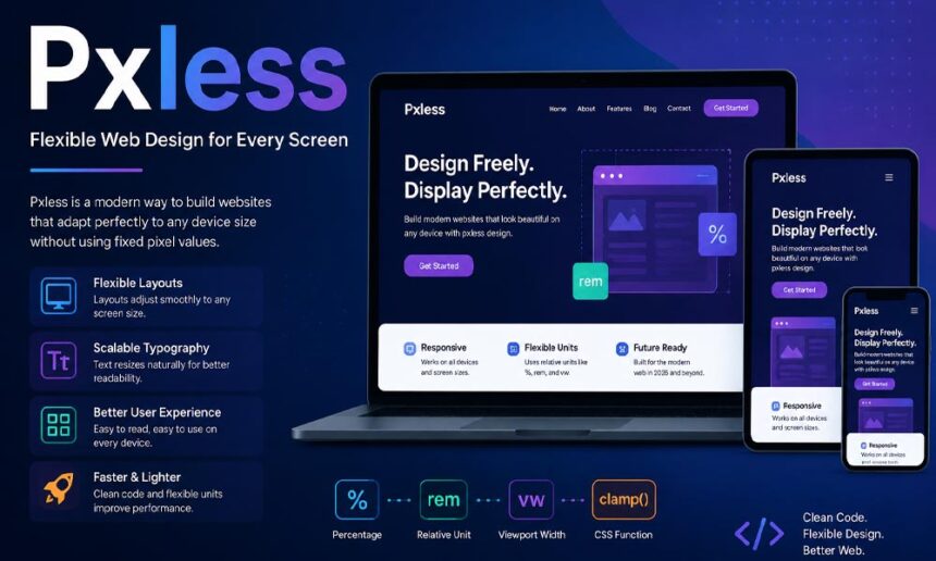
Have you ever opened a website on your laptop and thought, “This looks great!” Then, a little later, you opened the same website on your phone, and everything looked different. The text was too small, the images did not fit, and the buttons were difficult to tap. It can be frustrating, especially when you only want to read an article or buy something online.
This happens because many websites were built with fixed sizes. Years ago, most people used desktop computers, so fixed layouts worked well. Today, things are very different. In 2026, people use phones, tablets, laptops, large desktop screens, smart TVs, and even wearable devices to browse the internet. One fixed layout cannot work perfectly on every screen.
That is why more designers are talking about pxless. It is a modern way of building websites that can adjust to different screen sizes without breaking. Instead of forcing every element to stay the same size, pxless allows layouts to grow, shrink, and move naturally.
In this guide, you will learn what pxless means, how it works, why more designers are using it, and how it can help create websites that are easier to use. We will also explain the tools behind it, its benefits, its limits, and why it is becoming an important part of modern web design.
What Is Pxless?
The word pxless is made from two simple parts. The first part is px, which stands for pixels. Pixels are one of the most common units used in CSS to control the size of text, images, buttons, and many other parts of a website. The second part is less, which simply means using fewer fixed pixel values whenever it makes sense.
Many people think pxless is the name of a software program or a website builder. That is not usually true. In most cases, pxless is a design idea. It encourages developers to use flexible sizing instead of depending on exact pixel measurements everywhere.
For example, imagine you create a button that is always 200 pixels wide. It may look perfect on a laptop. But on a small phone, that same button may look too wide. On a very large screen, it may look too small. With pxless, the button can change its size based on the available space. It still looks balanced no matter where someone opens the website.
The goal of pxless is not to remove every pixel from a website. Pixels still have their place. Instead, the goal is to build layouts that adapt naturally to different screens, different browsers, and even different user settings.
How Pxless Web Design Works
The main idea behind pxless is very simple. Instead of telling every part of the page to stay one exact size, the layout is allowed to adjust based on the space available. The browser does most of the work automatically.
Think about pouring water into different glasses. The water changes shape to fit each glass. A pxless layout works in a similar way. It changes to fit the screen instead of forcing the screen to fit the layout.
When someone opens the website on a phone, sections become narrower. Images shrink without losing their place. Text stays easy to read. Buttons remain easy to tap. Then, when the same page opens on a large monitor, everything expands smoothly without looking stretched or empty.
Another important idea is that content comes first. Instead of forcing words into fixed boxes, pxless allows the content to decide how much space it needs. This makes articles easier to read and forms easier to complete.
Modern browsers make this possible by calculating flexible sizes behind the scenes. The visitor does not notice these calculations. They simply enjoy a website that feels smooth and comfortable on almost any device.
Pxless vs Fixed Pixel Design
To understand pxless, it helps to compare it with traditional pixel-based design.
In older websites, many elements were given exact sizes. A heading might be 40 pixels. A content box might be 800 pixels wide. An image might always stay the same height. These fixed values gave designers complete control, especially when most visitors used desktop computers.
The problem appeared as more screen sizes entered everyday life. A layout that looked perfect on one screen could easily break on another. Text could become difficult to read, buttons could overlap, and users might need to zoom in just to use the page.
A pxless layout works differently. Instead of fixed measurements, it uses flexible values that change with the available space. The page feels more natural because it adjusts continuously instead of staying rigid.
This does not mean pixels are bad. In fact, pixels are still useful for small details like thin borders, tiny icons, or certain visual effects. The real purpose of pxless is balance. It uses flexible sizing where flexibility helps while still allowing pixel values where they make sense.
A good modern website does not try to remove every pixel. It simply avoids using fixed sizes in places where they could make the design less useful.
Main Ideas Behind Pxless Design
Although pxless sounds like a new word, the ideas behind it have been growing for many years. The goal has always been the same: build websites that work well for everyone, no matter what device they use.
One important idea is fluid layouts. Instead of staying one fixed width, sections can grow or shrink depending on the screen. This keeps the page balanced whether someone is using a phone or a large desktop monitor.
Another key idea is scalable text. People do not all read the same way. Some visitors increase their browser text size because it is easier on their eyes. Pxless design supports this by allowing text to adjust instead of staying locked to one exact size.
Flexible spacing is also important. The empty space between headings, images, buttons, and paragraphs should change naturally as the screen changes. This helps every page look clean without feeling crowded.
Modern pxless design also uses reusable components. A button, card, menu, or information box can work in many places across a website. Instead of creating a different version for every page, one flexible component can adjust wherever it is used.
Another big part of the idea is accessibility. A website should not only look nice. It should also be easy for everyone to use. Flexible layouts can make reading easier when users zoom in, increase text size, or browse on smaller screens.
Together, these ideas help create websites that feel modern, simple, and comfortable to use.
Units Used in Pxless Web Design
One of the biggest changes in pxless is choosing the right units for the right job. Instead of using pixels everywhere, designers use several flexible units that respond to different situations.
The most common unit is rem. It is widely used for text, spacing, and margins because it follows the main font size of the page. If a visitor increases the browser’s default text size, elements based on rem can adjust more naturally.
Another useful unit is em. It works well inside buttons, menus, and other small parts of a website because it grows with the text inside that element. This helps keep everything balanced as font sizes change.
Percentages are also very helpful. Instead of saying a section must always be 900 pixels wide, a designer might allow it to use a percentage of the available space. This lets the layout fit many different screen sizes without extra work.
Viewport units like vw and vh are another useful choice. They use the size of the browser window as their guide. This can help create headings, banners, and sections that scale smoothly across different devices.
CSS Grid also introduces the fr unit. Instead of giving every column an exact width, developers divide the available space into flexible parts. This makes cards, galleries, and page layouts much easier to manage.
The important thing to remember is that no single unit is perfect for every situation. Good pxless design is about choosing the right unit for each part of the page instead of using the same one everywhere.
CSS Tools That Make Pxless Easier
Creating a pxless website has become much easier because modern CSS includes many powerful tools. Developers no longer have to rely only on fixed layouts and countless custom rules.
One of the most popular tools is Flexbox. It helps arrange buttons, menus, navigation bars, and groups of items. If the available space changes, Flexbox can move or resize elements automatically so they continue to fit neatly.
Another powerful tool is CSS Grid. It is perfect for larger page layouts with rows and columns. Product cards, photo galleries, blog pages, and dashboards all become much easier to organize with Grid because the layout can respond naturally to different screen sizes.
Functions such as clamp(), min(), and max() give developers even more control. Instead of allowing text to become far too large or too small, these functions keep sizes within safe limits while still letting them adjust smoothly.
Another exciting feature is container queries. Instead of responding only to the full screen size, individual sections can react to the size of their own container. This makes reusable components much smarter and more flexible.
Today’s design tools also support these ideas. Platforms like Figma, Webflow, and modern front-end frameworks make it easier for designers and developers to build flexible layouts together without starting from scratch every time.
Benefits of Pxless Design
Now that you understand how pxless works, let’s look at why so many designers are choosing it in 2026. The biggest reason is simple. It helps websites work better for real people using real devices.
Think about your daily life. You may read a news article on your phone during breakfast. Later, you continue reading on your laptop at work. At night, you might open the same page on a tablet. A pxless website makes this experience smooth because the layout adjusts naturally every time.
Another big benefit is a better user experience. Visitors do not need to zoom in or scroll sideways just to read a paragraph. Buttons stay easy to tap, images fit nicely, and menus remain simple to use. This makes people happier and encourages them to stay longer on the website.
A pxless layout can also make life easier for developers. Instead of creating many different layouts for different screen sizes, they can build flexible components that work almost everywhere. This saves time when building new pages and updating old ones.
Reusable components are another advantage. A card, button, form, or navigation menu can be used across many pages without needing major changes. This keeps the website consistent and easier to manage.
As new devices continue to appear, flexible design becomes even more valuable. Instead of worrying about every new screen size, developers can build websites that are ready to adapt.
Pxless and Responsive Web Design
Many people wonder if pxless is the same as responsive design. The answer is no, but the two ideas work very closely together.
Responsive design has been helping websites adjust to different screens for many years. It often uses breakpoints. These are points where the layout changes when the screen reaches a certain width.
Pxless focuses more on smooth changes between those breakpoints. Instead of waiting for one exact screen size before changing the layout, many parts of the page can adjust little by little as the screen changes.
For example, a heading can grow slowly instead of suddenly jumping from one size to another. A group of cards can rearrange themselves naturally instead of switching to a completely different layout all at once.
This does not mean responsive design is old or outdated. In fact, many modern websites use both ideas together. They combine flexible units, CSS Grid, Flexbox, and a few carefully chosen media queries.
The best websites are usually balanced. They use fixed values where they make sense and flexible values where they improve the experience. That balance is one of the biggest ideas behind pxless. Working with an expert Chicago web design agency helps brands master this balance, ensuring fluid layouts that adapt seamlessly across every device while maintaining precise brand aesthetics.
How Pxless Supports Accessibility
A good website should work for everyone. That is why accessibility is such an important part of modern web design.
Some people increase the text size in their browser because small words are difficult to read. Others zoom in to see content more clearly. A pxless layout can support these users because many parts of the page are allowed to grow instead of staying locked to fixed sizes.
Imagine reading a long article on your phone. If the text becomes larger but the boxes stay the same height, some words may disappear. Flexible layouts help prevent this problem by giving content enough room to expand.
Another important benefit is content reflow. When someone zooms in, the page should rearrange itself instead of forcing the reader to scroll left and right. This makes reading much more comfortable.
Good accessibility also includes keyboard navigation, clear headings, strong color contrast, helpful image descriptions, and easy-to-use forms. Pxless supports accessibility, but it is only one part of building a website that everyone can enjoy.
Does Pxless Help SEO?
Many website owners ask if pxless can improve SEO. The simple answer is yes, but not in the way many people think.
Google does not give a higher ranking just because a website uses flexible units instead of pixels. There is no special ranking rule that rewards pxless by itself.
However, pxless can improve many things that search engines do care about. A website that works well on phones gives visitors a better experience. People can read content more easily, use menus without problems, and complete forms without frustration.
Another helpful point is page stability. Flexible layouts often reduce broken sections, overlapping text, and elements that move into the wrong place. This creates a cleaner experience for visitors.
Page speed is also important, but pxless alone does not make a website faster. Large images, heavy scripts, poor hosting, and slow code still affect loading time. A good website combines flexible design with proper performance improvements.
In the end, the best SEO still comes from useful content, clear headings, fast loading pages, and a website that is easy to use on every screen.
How to Build and Test a Pxless Layout
If you want to start using pxless, you do not need to rebuild your entire website overnight. Small changes can make a big difference.
A good first step is creating flexible containers instead of fixed-width boxes. This allows the content to grow and shrink naturally on different devices.
Next, use units like rem for text and spacing. These units respond better to user settings and help create a more comfortable reading experience.
You can then build layouts using Flexbox and CSS Grid. These tools make it much easier to arrange menus, images, forms, and content sections without depending on fixed widths.
Functions like clamp() are also helpful. They allow headings and spacing to grow within safe limits. This keeps text readable on both small phones and large monitors.
Testing is just as important as building. Open your website on a phone, tablet, laptop, and desktop computer. Try making the browser window smaller. Increase the text size. Zoom in. Check if buttons remain easy to click and if nothing overlaps.
Also test with longer headings, larger images, and error messages. Real visitors will not always use perfect content. A strong pxless layout should handle these situations without breaking.
Limits and Common Pxless Mistakes
Even though pxless is very useful, it is not perfect. Like every design method, it has a few challenges.
The first challenge is learning a new way of thinking. Designers who have worked with fixed pixel values for many years may need some time to become comfortable with flexible layouts.
Another common mistake is believing that every pixel must disappear. That is not true. Thin borders, icons, shadows, and other small details can still use pixels when they work best.
Some developers also use flexible units without setting limits. This can create very large headings on wide screens or very small elements on tiny devices. That is why tools like clamp(), min(), and max() are so helpful.
Older websites may also need extra work before they fully support modern CSS features. Some themes or plugins may still depend on older layout methods.
Finally, never skip testing. A design that looks perfect on one screen may still have problems somewhere else. Testing on different devices is one of the most important parts of building a successful pxless website.
The Future of Pxless Web Design
The future of pxless looks very promising. As technology keeps changing, websites also need to become more flexible.
People already use many kinds of screens every day. New devices continue to appear, and each one has different sizes and shapes. Flexible layouts make it much easier to prepare for these changes.
In 2026, many teams are also using shared design systems. Buttons, forms, menus, and cards are built once and used across many projects. Pxless works well with this approach because flexible components can fit into many different layouts.
Artificial intelligence is also becoming more helpful during the design process. AI tools can suggest layout improvements, check different screen sizes, and even find design problems before a website goes live.
New experiences like smart TVs, foldable phones, wearable devices, and AR or VR environments also benefit from flexible layouts. While the name pxless may change over time, the idea of building websites that can adapt to different spaces will continue to grow.
Conclusion
The internet has changed a lot over the past few years. People no longer visit websites from only one type of device. They move between phones, tablets, laptops, desktops, and many other screens every day.
That is why pxless is becoming an important design idea. It helps developers build websites that respond naturally instead of depending only on fixed pixel values.
It is also important to remember that pxless does not mean removing every pixel from your CSS. Pixels still have useful jobs. The real goal is choosing the right tool for the right situation and allowing layouts to stay flexible whenever possible.
When combined with responsive design, modern CSS tools, and good accessibility practices, pxless creates websites that are easier to read, easier to use, and easier to maintain.
If you are just getting started, begin with small steps. Replace a few fixed sizes with flexible ones. Try Flexbox or CSS Grid. Test your pages on different devices. As you gain experience, building flexible layouts will become much more natural.
The future of web design is not about making every website look the same. It is about creating websites that work well for everyone. That is exactly what pxless is trying to achieve.
(FAQs)
What is pxless in simple words?
Pxless is a modern web design approach that uses fewer fixed pixel (px) values and more flexible units like rem, %, and vw. This allows websites to adjust smoothly to different screen sizes, making them easier to use on phones, tablets, laptops, and desktop computers.
Is pxless a software, framework, or design tool?
No. Pxless is generally not a software program or an official framework. It is an informal term that describes a flexible way of designing websites. Developers can create pxless layouts using standard web technologies such as HTML, CSS, Flexbox, CSS Grid, and modern CSS functions.
Does pxless mean websites never use pixels?
No. A pxless website can still use pixel values where they make sense, such as for thin borders, small icons, or fine visual details. The main idea is to avoid depending on fixed pixel sizes for major layout elements like containers, text, and spacing.
How is pxless different from traditional pixel-based design?
Traditional pixel-based design gives many elements fixed sizes that may not work well on every screen. Pxless design uses flexible values that allow layouts, text, images, and buttons to grow or shrink naturally. This creates a smoother experience across different devices.
Is pxless the same as responsive web design?
Not exactly. Pxless and responsive design are closely connected, but they are not identical. Responsive design often uses breakpoints to change layouts at certain screen widths, while pxless focuses more on continuous flexibility using relative units and modern CSS tools. Many websites successfully combine both methods.
Which CSS units are commonly used in pxless design?
A pxless layout commonly uses units such as rem, em, percentages (%), viewport units (vw and vh), and fr units in CSS Grid. Developers also use functions like clamp(), min(), and max() to keep layouts flexible while maintaining sensible size limits.
Does pxless improve SEO?
Pxless does not directly improve search rankings. However, it can support SEO by making websites more mobile-friendly, improving user experience, reducing layout problems, and helping visitors stay on the page longer. Combined with fast loading speeds and quality content, it can contribute to better overall website performance.
Is pxless good for accessibility?
Yes. Pxless can support accessibility by allowing text and layouts to adapt when users zoom in or increase their browser’s font size. Flexible layouts help prevent content from being cut off and make websites easier to read on different devices. However, accessibility also requires proper headings, color contrast, keyboard navigation, and image alt text.
Can beginners start using pxless design?
Yes. Beginners can learn pxless step by step. A good starting point is replacing fixed pixel values with flexible units like rem or %. Learning Flexbox, CSS Grid, and basic responsive design will also make it much easier to build modern, flexible websites over time.
Is pxless the future of web design?
Many designers believe pxless represents the future direction of web design because users continue to browse on more types of devices than ever before. While the name “pxless” may not become an official standard, the ideas behind it—flexible layouts, scalable typography, responsive components, and better accessibility—are expected to remain an important part of modern website development.
You might also like: Kaley Cuoco NUXE: Is This the Secret Behind Her Natural Glow?